
REDESIGNING
NEONATAL intubation
reduce infant injuries
improve USER comfort
train NURSES
Roles: Product Manager, Designer
Situation
Our Actions
Result
Neonatal intubation is a procedure that supplies air to a newborn baby who can’t breathe.
It’s done using a tool with a blade, and it must happen in under 30 seconds.
Intubation can injure a baby if the tool is pressed into the top of their mouth. This happens if a nurse rotates the tool instead of pushing it forward.
There are 2 causes for this:
The intubation tool has hardly been redesigned since its invention in the early 1900s.
Improper technique is a habit, even among trained nurses.
Redesign the intubation tool to encourage proper technique.
Create an interface that aids with training nurses.
Prototyped an ergonomic intubation tool.
Designed a responsive digital training interface, complete with a force sensor and real-time feedback.
SKILLS
Product Management
Figma
UX Research
Arduino
WHAT WE MADE

Our novel interface, featuring a real-time force sensor that feeds in Arduino data.

The process began with paper prototypes.

We first tested the paper prototype interface with Product Design students

Feedback from the paper prototype testing led to a digital MVP. We paired it with an Arduino force sensor to produce real-time feedback.

After testing with Stanford nurses, we learned that our MVP needed better readability and more context about what each section meant. We refined our MVP to include more contrast and labels.

Following graphic design principles, we devised a mood board to inform the appearance and functionality of our final design.
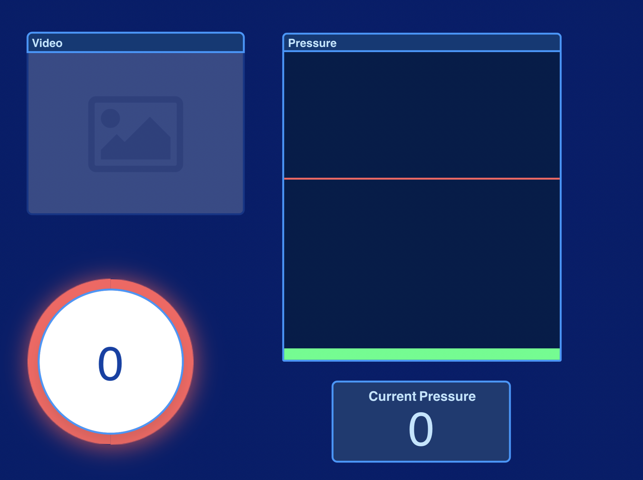
The final interface design. This screenshot represents what it looks like when time runs out to perform intubation.

Final interface, with the timer counting down
Demo of our lo-fi interface, with live force sensor readings

Our redesigned intubation tool.
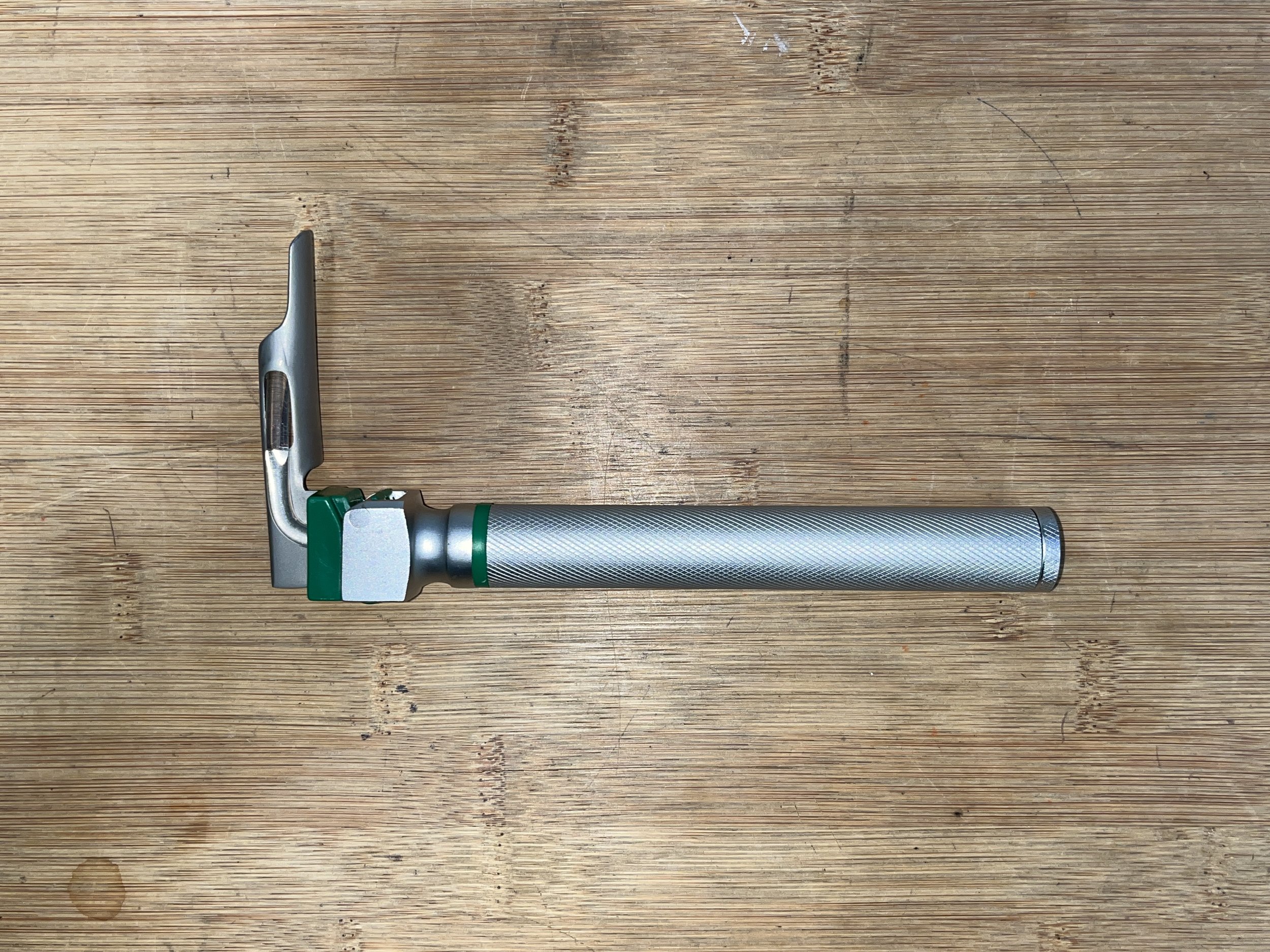
The existing intubation tool. Features a right-angle blade and rod-like handle.
An artistic render of the tool's original 1937 patent drawing. Clearly, not much has changed about the design for almost 100 years.

After researching neonatal intubation and watching multiple videos demonstrating the procedure, we made a hierarchical task analysis. We identified a pain point at step 2.2, where nurses had their attention divided between observing the baby's throat while also observing the blade's position.

A lo-fi physical prototype of a tool with an offset and slanted blade.

Concept sketch for a redesign of the tool's blade. The blade is offset (to enhance visibility of the baby's throat) and angled downward (to encourage the proper technique of pushing instead of rotating).

3-D printed and foam prototypes, featuring contoured grips and offset blades.

3D render of one possible redesign. The handle features bulbed and straight sections, inspired by the different grips we observed among different nurses during user testing.

Nurses who tested the prototypes informed us that the contoured handle was helpful, but the offset blade felt unnatural. We were grateful to know what did and didn't work about our prototype. We quickly eliminated the blade offset, then iterated on the handle shape.

I organized a user testing session with Stanford Hospital nurses.

Our team with Dr Lou Halamek, the project sponsor.
CLOSING THOUGHTS
My product design stint with Stanford Health Care was incredibly fulfilling. It taught me the importance of letting go of design features that don’t function as intended, even if a lot of effort was put into them. I am deeply grateful for the time and expertise of the nurses with whom we performed our user tests.
If I continued this project, I’d explore different ways to incorporate real-time feedback into the training process. One example would be haptic feedback, such as the handle vibrating when a nurse exceeds the force threshold.